A truly talented interior designer knows how to combine his/her client’s personality and personal preferences to turn a blank canvas into a spectacular piece of art. In fact, it’s quite accurate to perceive different interior designs as representations of different moods, mindsets, or personality types. In this context, colour psychology plays a vital role in deciding the mood or the vibe of a design.
Have you ever noticed that neutral or light-coloured spaces exude a sense of calm and peacefulness while you tend to feel excited or energized after spending time in a bright and colourful space? It is because different colours affect your moods and emotions differently. Some colours tend to make you feel happy and positive, while others can affect your mood negatively, making you feel either restless, hyperactive, dull, or demotivated. Therefore, it is super important to pick the right colours for your design.
To decode the world of colour psychology, we have created this blog, in which we will discuss the role of colour psychology in interior design and how you can reap the benefits of this science to make your space, not just LOOK great, but also, FEEL a certain way, as per your personal preferences. This knowledge would be particularly helpful for those who are working with a commercial design since every brand comes with its own, unique brand image and brand values to attract a very specific target audience.
What is Colour Psychology?
Colour psychology focuses on how we can use colours to create a distinct ambience with a certain kind of mood and vibe to it. A set of hues are carefully picked by designers to invoke a very specific emotional response in the minds of their customers or employees. This strategy helps set a certain mood of the space.
Research has shown that every colour can be associated with a specific set of emotions and behavioural patterns. For example, when we are surrounded by nature and greenery, it’s very natural for us to feel healthy, energized, and in general – full of life. Now, colour psychology says that even if you are indoors, by using the colour green as the primary hue of your design, you can invoke that same feeling of being in a life-affirming, health-promoting atmosphere.
What’s the scientific basis of this? Well, in 1666, Sir Issac Newton discovered that white light gets separated into seven different colours when it is passed through a prism. He also discovered that each of these colours is made up of a unique wavelength. Now, modern science also proves that every emotion has its own wavelength, just like every colour has. So, it’s not very difficult to put two and two together to understand that colours can be used in a design to generate emotions of a similar wavelength and frequency. This is the basis of colour psychology in interior design, graphic designing, cinematography, photography, visual arts, advertising, marketing, fashion, branding, and even light therapy.
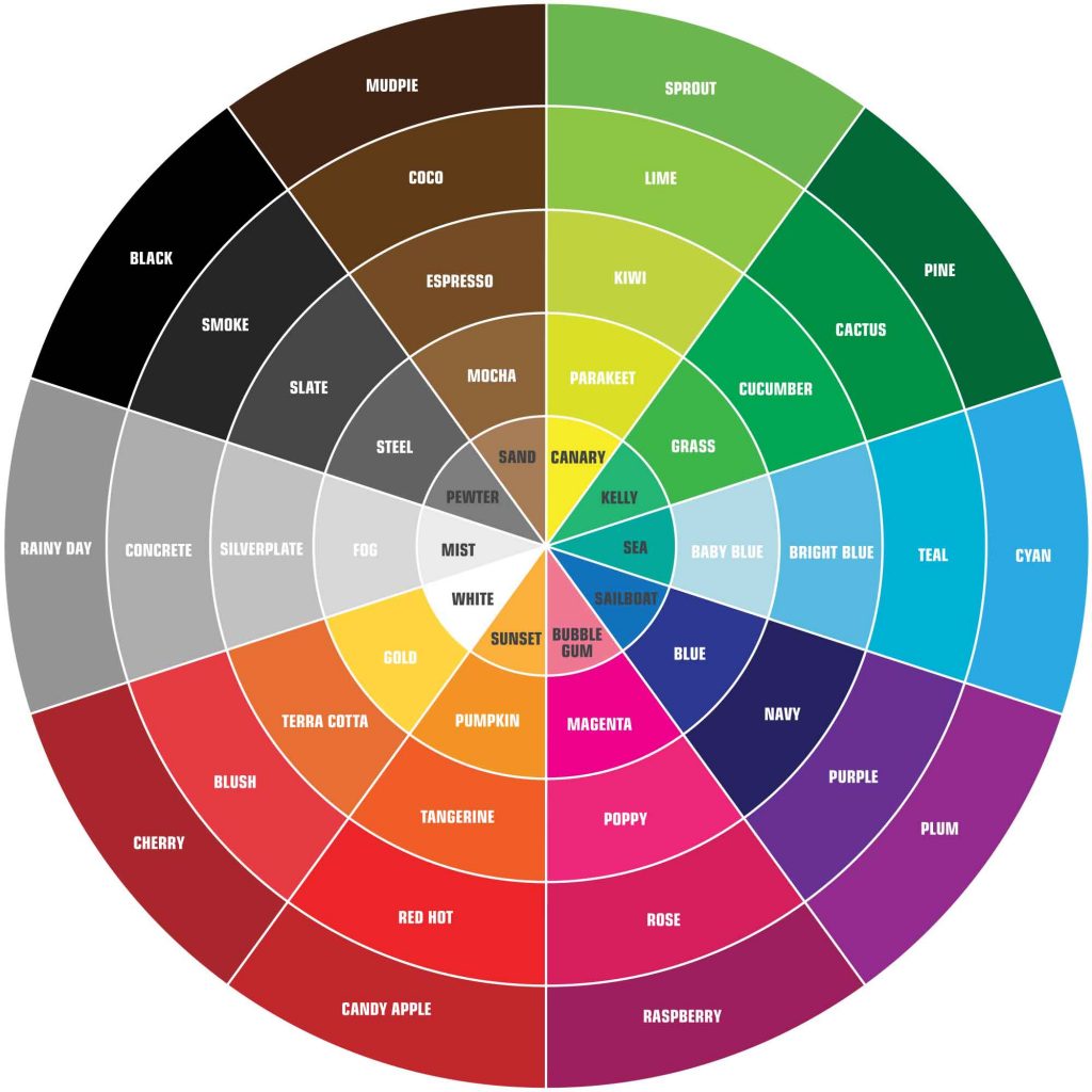
What is a Colour Wheel?
Before delving deeper into colour psychology, it’s important to know how to work with a colour wheel since it is the most widely used tool for arranging different colours together in a colour scheme.
A colour wheel can be defined as an arrangement of colours inside a circle. A basic colour wheel consists of 12 basic colours – 3 primary, 3 secondaries, and 6 tertiary colours, which are formed by mixing the primary and secondary colours together. But a more advanced wheel could contain many more colours, which are further manifestations of the tertiary colours. Irrespective of how many colours are there, they are always arranged in the same order as they seem to appear in the VIBGYOR.
Now the rules of picking a colour combination with the help of a colour wheel are pretty simple. Here are a few common combinations that tend to look great together –
- Complementary – Also called contrasting colours, these are the two colours that are located exactly opposite to each other on the wheel. For example – green and red.
- Monochrome – Shades, tones, or tints of the same colour. For example – raspberry, rose, and bubblegum (different shades of pink).
- Analogous – Two or more colours which are located side by side on the colour wheel. For example – orange, yellow-orange, and yellow.
There are many other combinations that tend to look and feel great in a colour scheme like Triadic and Tetradic colours, but the above three are the most commonly used ones when it comes to colour psychology for interior design.
Common Colours Used in Interior Designing and Their Associated Effects on the Human Psyche
Colour Psychology in Interior Design Colour 1 – Blue
Blue
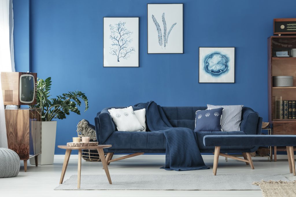
Blue is one of the three primary colours (red and green being the other two). It is located on the farthest end of the light’s spectrum and is considered to be the coolest (temperature-wise) colour to work with. It is believed that blue can help bring down blood pressure and can even slow down an elevated heart rate.
Psychological Effect of Blue – Deeper shades of blue invokes a sense of confidence while generating an atmosphere of trust, loyalty, and dependability. Lighter shades of blue, on the other hand, are generally associated with the feeling of calmness, serenity, relaxation, and coolheadedness. Blue is also considered to be a symbol of peace.
Colour Psychology In Interior Design Using Blue – Many interior designers love working with blue while designing bedrooms and bathrooms – the two places where you get to relax and rewind after a hard day’s work. These days people love experimenting with blue furniture, especially blue painted wooden storage units. This type of decor goes really well with an otherwise simple, minimalistic, boho design. Combining a deeper shade of blue with white or 2 or more different shades of blue itself are a few very popular colour schemes being followed in commercial as well as residential settings.
Cultural Significance of Blue – Western countries often associate blue with sadness and gloominess, thus the phrase – ‘feeling blue’. But in Eastern countries blue is considered to be the holiest of colours. For example – In India, religious deities like Krishna, Rama, and Shiva are always depicted blue bodied as blue is considered to be a symbol of purity and divinity. Another interesting fact is that even though blue is often considered to be the symbol of masculinity, in China it is a symbol of femininity.
Colour Psychology in Interior Design Colour 2 – Yellow
Yellow
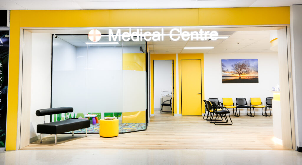
Ah, the sunshine colour! Yellow is associated with many feelings and emotions, but one thing it truly stands for is happiness and positivity. It makes the whole space come alive and creates an atmosphere of vivaciousness, playfulness, and joy. Since yellow lights are so commonly used in both commercial as well as residential settings, the colour yellow is also considered to be the colour of light and luminosity. Most of the new-age designers love to use yellow when it comes to colour psychology in interior design.
Psychological Effect of Yellow – Due to its close resemblance to the colour gold, yellow is often associated with prosperity and abundance. It is also considered to be the colour of wisdom, intelligence, and self-confidence. Since it is such a bright and happy colour, it instantly uplifts people’s spirits and brings a smile to their faces. It generates a feeling of optimism and encouragement.
Colour Psychology in Interior Design Using Yellow – Using yellow as your primary colour is a great idea to make the space appear bigger and brighter. But you can’t go all out with this colour, since too much yellow can make people feel sick or dizzy. Too much yellow sometimes generates too many emotions. So, always balance it out with neutral colours like white, grey, or a darker shade of blue.
It’s a wonderful option for kitchens and dining areas for residential properties as well as for commercial kitchens. Yellow combined with red is a very potent colour for hunger stimulation. So, no wonder many restaurants and fast food joints opt for this combo as their main colour scheme for their logos as well as for their interiors. Instead of painting the walls yellow, you can consider installing bright yellow statement furniture and yellow accessories to get a similar effect.
Cultural Significance of Yellow – Culturally, yellow means different things to different people. In France and Germany, yellow is considered to be the symbol of jealousy and betrayal. In China, it symbolizes pornography! A yellow picture or a yellow book literally means a pornographic publication. In African and Egyptian cultures, yellow is revered as the colour of prosperity and wealth. Japanese consider yellow to be the colour of bravery and courage.
Colour Psychology in Interior Design Colour 3 – Purple
Purple
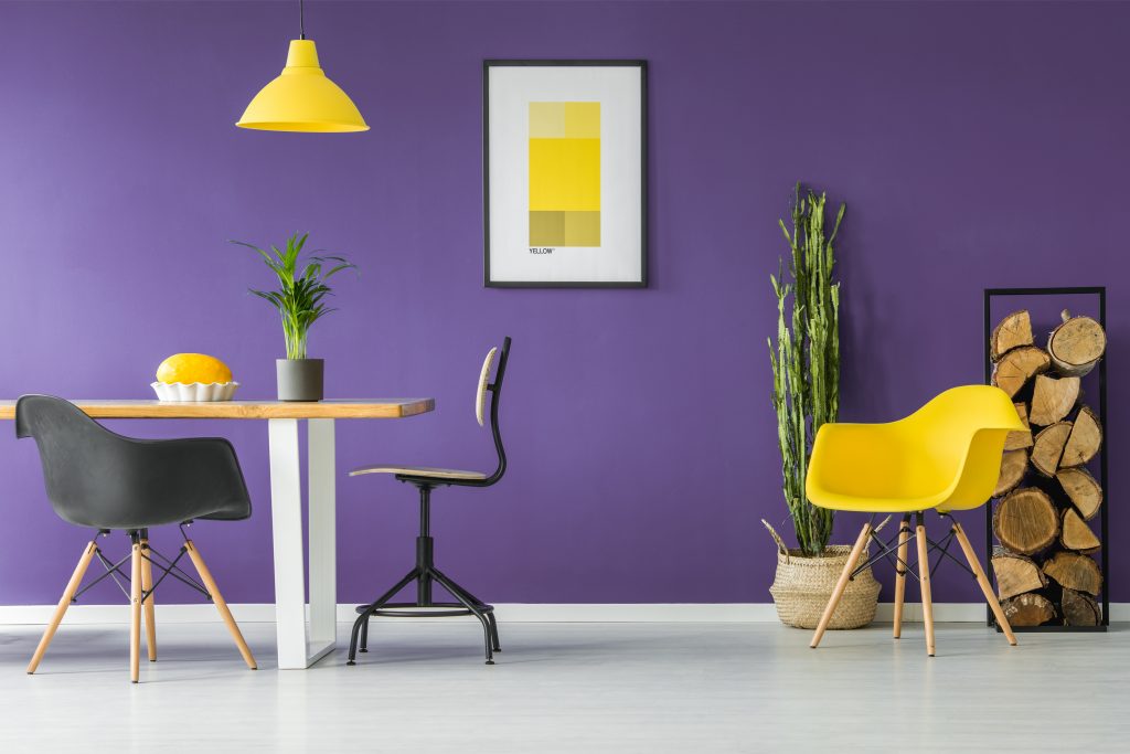
Always the colour of elegance and royalty, purple colour schemes inspire creativity and sophistication. While darker shades of purple look quintessentially classy, the lighter shades such as mauve and lavender create an atmosphere of calmness and poise, but in a much subtle manner. Since it is the colour of elegance and luxury, purple is often used to decorate living room areas, receptions, foyers, and dining rooms, areas where your guests spend maximum time.
Psychological Effect of Purple – It is a colour with a strong connection with creativity. It is believed that children should be surrounded by purple during the early years of their education to help their imagination and creativity flourish. Purple creates a psychological effect of being in a royal setting, surrounded by beauty and opulence. It is a very popular colour among women, but deeper shades of purple can look incredibly masculine.
Colour Psychology in Interior Design Using Purple – Since purple is the colour of wealth, luxury, and extravagance, it is used extensively in luxury stores, design studios, high fashion retail stores, and beauty salons and spas. Being the colour of fantasy and dreams, purple interiors are also considered to be a perfect choice for the kids’ section of a retail business. In fact, in a retail setting, it’s always advisable to use purple to highlight your best, most expensive, and premium looking products.
Cultural Significance of Purple – Both, in Western and Eastern countries, purple signifies power, wealth, fame, and royalty. For many centuries in a row, extracting purple dye from natural resources was an expensive and time-consuming process. Because of this reason, only wealthy people could afford to dress in purple clothes or accessories. In the past, kings, queens, and some of their closest associates used to wear purple as a status symbol.
But in some countries purple is also considered inauspicious. In the UK, Italy, Thailand, and Brazil, it is customary to wear purple along with black while attending someone’s funeral. In the US, purple is regarded as the colour of honour and courage. Their highest military award, the Purple Heart, is conferred to soldiers, airmen, sailors, and Marines to celebrate their distinguished acts of bravery.
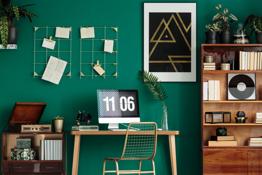
Colour Psychology in Interior Design Colour 4 – Green
Green
Whenever we see the colour green, we think of greenery and nature. Now, since being in nature signifies health, connection with the soil, peace, harmony, and trust, it’s only natural to associate green colour with all these emotions or qualities. Green has a very fresh and wholesome feel to it and if used properly, in the right context and quantity, green can have a very calming effect on your psyche.
Psychological Effect of Green – Green is probably the most versatile colour you can work with. Different shades and tones of green can generate different emotions in people. While pale green has a relaxing effect, dark green is usually considered to be the colour of greed and jealousy. Olive green, on the other hand, is recognized as the symbol of peace and harmony. In general, green is the colour of relaxation, comfort, health, growth, fertility, healing, ambition, and a sense of security.
Colour Psychology in Interior Design Using Green – Green can be used in almost every kind of setting in a commercial design. You can use multiple shades of green together to create a very appealing colour scheme. Green-coloured accessories in the form of pieces of furniture, furnishings, and indoor plants look amazing as well. If you are working on a project which is located right in the middle of a busy street of a city, add a lot of green to it to make it feel refreshing and outdoorsy. Use as many actual plants as possible for this purpose along with accent walls, green accessories, and statement furniture in shades like emerald, fern, and mint.
Cultural Significance of Green – The colour green shares quite a few common connotations on a global level. These include – nature, environment, ability to regenerate, military, and ‘the go signal of the traffic lights. In the West, green is the symbol of money, greed, and also, Christmas! In Eastern cultures, green symbolizes eternal life, fresh beginnings, youth, and prosperity. In Mexico, green is considered to be the colour of freedom and in Ireland, the colour of good luck.
Colour Psychology in Interior Design Colour 5 – White and Greys
White and Greys
Also known as the neutrals or the neutral colours, white and lighter shades of grey are every interior designer’s true secret weapons. How they’ve used the neutrals ultimately makes or breaks the core aesthetic value of any design. What’s their superpower, you might ask? Well, it’s their ability to seamlessly blend with almost every other colour you can think of.
Neutrals can be used in two ways – to add a base or a foundation upon which a colour theme is built (for example – white and blue) or to lighten up a design by balancing it out and making it more subtle (for example – the combination of golden and grey). You can even use white and grey (two neutrals) together to create a really interesting design pattern. Add lots of green to the mix and what you’ll have is an exceptionally modernistic design that looks fresh and elegant.
Colour Psychology in Interior Design Using White and Grey – White is usually associated with peace and harmony. It symbolizes purity, clarity, light, and divinity. Using lots of white in your design can have a calming effect on your psyche. It makes the space look bigger, brighter, better ventilated, and cleaner. This is why white is often used in abundance while designing a small or ‘not so effectively’ constructed commercial space. It’s an ideal colour for people who tend to feel claustrophobic, tense, anxious, or agitated. It calms them down and brings a certain level of balance and harmony into their lives.
Grey is considered to be a really elegant colour but too much grey can end up looking depressing. It’s ideal to use grey in combination with a brighter colour like yellow, pink, or blue. Most designers avoid grey on the walls but love to add grey accessories and textiles to add a touch of sophistication to the overall design. Also, it’s advisable to avoid grey if your space doesn’t receive a good amount of natural sunlight on a daily basis.
Cultural Significance of White and Grey – White is often associated with weddings, thus it is considered to be a really auspicious colour, especially in Western countries. In the East as well, white symbolizes purity and divinity. In fact, white is worn to funerals in the Eastern countries, not because it’s inauspicious, but because it is believed that it keeps you safe from the gloominess of death. Globally, white is regarded as the colour of the truce. A white flag literally means ‘we are willing to surrender for peace’.
In Western countries, grey symbolizes logic, formal associations, conservatism, and business acumen. In the UK, grey became a popular colour during the Renaissance as more and more artists (including Rembrandt and El Greco) started experimenting with the play of shadow and light in their work.
Colour Psychology in Interior Design Colour 6 – Red and Earthy Shades of Red
Red and Earthy Shades of Red
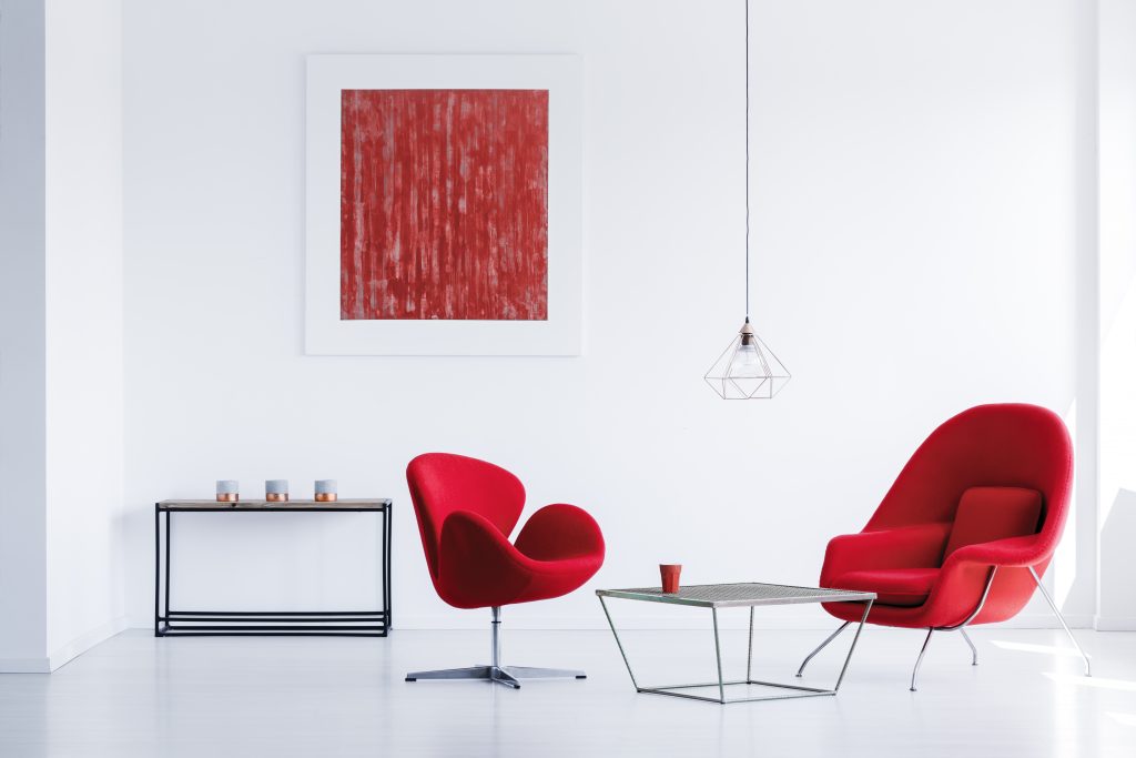
Red and its shades lie on the other far end of the light’s spectrum and are usually associated with deep emotions, energy, power, passion, love, desire, anger, and revenge. It is one of the most vibrant colours to work with and can be used in a million different ways to create a variety of moods and ambiences. Earthy shades or the shades that occur naturally in nature (examples – brown, mustard, beige, sand, etc.) always have a tinge of red in them. These are also warm colours like red itself and can be used to create a welcoming atmosphere, filled with comfort and positivity.
Colour Psychology in Interior Design Using Red and Earthy Shades of Red – Red is an energetic colour and using it in an interior design brings excitement and enthusiasm into the space. It is considered to be the colour of willpower, leadership, confidence, and ambition. Thus, it is very common to see the use of red in business settings, office complexes, sports arenas, and retail stores. Since it is associated with action, creativity, and productivity, red is one of the most preferred colours for a commercial design. Red combined with yellow is one of the most commonly used colour schemes for restaurants and fast food joints. It is so because this combo stimulates hunger and encourages impulsive behaviour.
Earthy shades of red including mustard, tan, chocolate, saddle brown, and bisque are often connected to stability, protection, timelessness, humility, and caring nature. Thus, these shades are used to neutralize the effect of red in a design. If they are being used individually, the purpose could be to create an atmosphere of trust, comfort, and effortless elegance.
Cultural Significance of Red – In SouthEast Asia, red is considered to be an auspicious colour. Brides usually wear red in India so it is regarded as the colour of celebration, happiness, and joy. In Japanese culture, red is the colour of life, anger, and also danger. In Mexico and some other Latin countries, red is associated with religious ceremonies and rituals. In South Africa, red signifies the sacrifices made by the freedom fighters and in China, red is considered to be the colour of good luck, prosperity, and the gift of a long and healthy life.
Impact of Different Colours on the Psyche of Your Employees
In a commercial setup, colour psychology is extensively used in order to control or manipulate the behaviour of your customers or clients. But can you do the same for your employees? Why not? The same principles of colour psychology can be used to boost productivity or to reduce stress levels in an office environment. Here are some of our quick tips and tricks on how you can use colour psychology in interior design to change the psyche of your employees –
Green for Boosting Creativity – Research shows that green interiors can help ignite your creative fires. It is linked with creative thoughts and open-mindedness. Since green signifies growth, being in green interiors can boost your employees’ creativity and help them grow professionally. Green is also good for keeping your employees focused. It increases the concentration power while helping you stay alert and attentive.
Blue for a Relaxing Environment – As we’ve discussed above as well, blue can have a very calming effect on you. It lowers blood pressure and helps you relax. So, it is always advisable to use blue in order to create a stress-free environment for your employees. Blue is particularly beneficial for those whose job is to come up with new ideas all the time. It supports the thought process and helps you concentrate better.
Orange Lifts the Mood – Orange reminds people of the sun and its life-affirming warmth that keeps everything alive on this planet. Orange colour makes the environment feel welcoming and nurturing. It can be used in a commercial setting to lift the mood of your employees instantly. It is also believed that orange interiors increase the oxygen supply to the brain, which makes people more active with an enhanced ability to concentrate.
Use Red for Areas That Need Your Immediate Attention – Red is usually avoided as the primary colour of an interior design theme since it’s too bright, too bold, and is often associated with too much heat and energy. It tends to increase the heart rate and could make your employees feel restless or anxious. But using red in specific areas that might need your employees’ urgent attention is always a good idea. People whose work entails a lot of physical activity respond well to red. So, using red in a sports complex or a gym is definitely a good decision.
Conclusion
The science of colour psychology in interior designing is still evolving and there’s still a lot to explore and learn, but by using the basic guidelines given in this blog you can easily understand how to work with various different types of colours to create an impactful interior design for your commercial property. Though these pointers could lead you in the right direction, it’s always advisable to involve your clients while deciding on a colour scheme for your business. Go for the colours which your customers like the most. Also, do not hesitate to take help from a professional fitout expert or an interior designer while working with various different colours for your interiors.
How ImpeccaBuild Can Help You Choose the Right Colours for Your Interiors
Since choosing the right colour scheme for a commercial space needs a certain amount of additional planning work and creative thinking, hiring an experienced fitout professional would certainly make things easier and quicker. Call Us On: 1300 LETS BUILD or send us an email at: Info@impeccabuild.com.au and we will help you understand the nuances of colour psychology in interior designing best suitable for the specific needs of your business.
You Might Also like:
If you enjoyed reading “Colour Psychology in Interior Design”, you may also be interested in:
- An Impeccable Office Layout Design Guide
- Office Layout Ideas – An Impeccable Guide
- Office Plants – An Impeccable Guide
- Office Renovation – An Impeccable Guide
- Open Plan Office Guide – 4 Proven Advantages Guaranteed To Increase Your Productivity
- 5 Small Work Office Design Ideas, Guaranteed To Increase Productivity
- Office Fit Out Company – 6 Essential Tips For Choosing The Right Builder
- Office Fit Out Costs Sydney – A Free & Simple 3 Part Guide