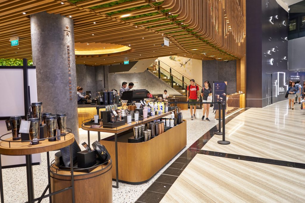
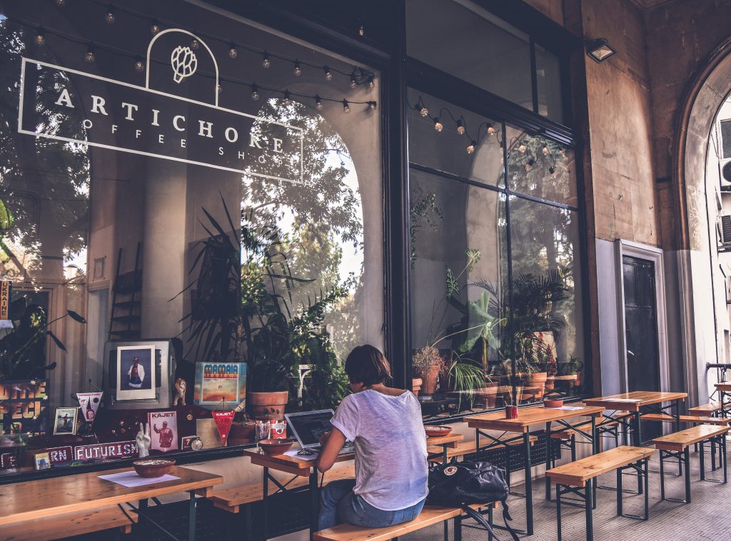
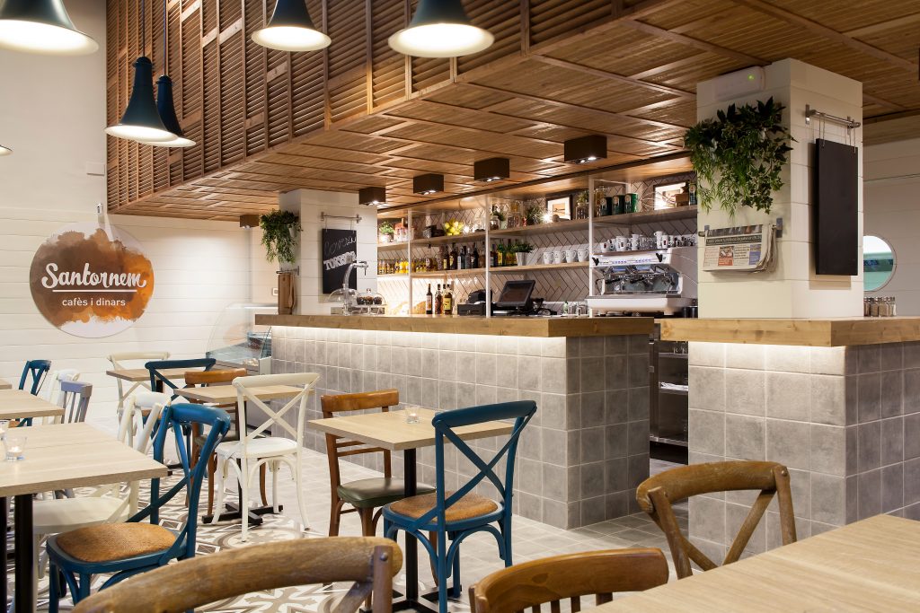
Imagine it’s your partner or best friend’s birthday. You’ve planned a fun-filled dinner party by inviting some of your close friends to this new cafe in town.
Everyone is thrilled to spend some amazing time eating finger-licking good food in a setting that’s comfortable with touches of elegance. But wait, what is this? As soon as you enter the place, the whole vibe is that of a mediocre restaurant.
You are led to your table, and the seats are pretty uncomfortable. Everyone’s expression says it all, but still, your friends are trying to put on a good face. The music is horrible, and the drop light above your table is the reason why everyone has a headache now.
Would you want to go back to this cafe, ever? Of course, you won’t; even if it starts serving incredible food, you wouldn’t want to step inside this cafe ever again, right?
<script async src="https://pagead2.googlesyndication.com/pagead/js/adsbygoogle.js?client=ca-pub-1037652534985097"
     crossorigin="anonymous"></script>
<ins class="adsbygoogle"
     style="display:block; text-align:center;"
     data-ad-layout="in-article"
     data-ad-format="fluid"
     data-ad-client="ca-pub-1037652534985097"
     data-ad-slot="5244006718"></ins>
<script>
     (adsbygoogle = window.adsbygoogle || []).push({});
</script>
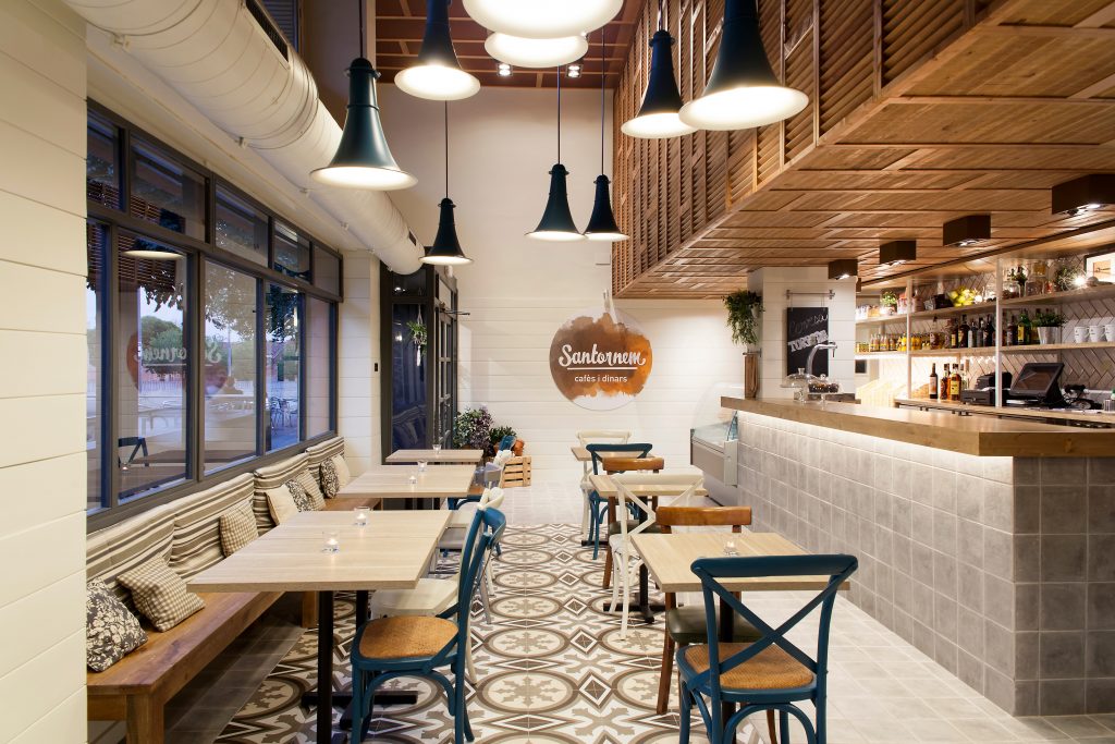
Impact of a Stylish Cafe Interior Design
The above example clearly shows how important it is to create the right kind of ambience. Quality of food is no longer the only criterion based on which a cafe or a restaurant is judged these days. Anyone can cook a decent meal in their home.
So what’s the point of going to a restaurant or a cafe and spending the extra money? People go out not just for great food but for an overall great experience.
Do you know the stats show that 60% of new restaurant businesses fail in their first year because they weren’t prepared enough to manage the place? The room for error is very little and what kind of ambience you’ve created plays a huge role in deciding how successful your venture is going to be.
That’s why cafe owners these days go all out to ensure that their cafe interior designs are absolutely gorgeous looking to attract more and more customers. Edgy cafe interior design could make all the difference in setting you apart from your arch competitors.
Well, it’s true that your cafe should reflect who you are as a person. However, there are a few universal ‘golden rules when it comes to cafe interior design. Follow these 7 simple cafe interior designing ideas, tips, and tricks to make sure your customers keep coming back for more –
TIP #1
Location of the Cafe
Where your cafe is located is the first thing that decides what kind of customer base you’ll attract. It determines how easy or difficult it’s going to be to woo new customers and what kind of menu will work for them. Three main types of locations work well for a cafe setting –
• A Mall Location – Starting a cafe that is located inside a popular shopping centre or a mall is also a great option. Since all kinds of people visit malls all year round, you’ll never be out of work because of your location.
• A Corner Location – A cafe which is located at a junction point easily attracts office-goers in the morning. Your cafe is the first shop on the street, and many people find that convenient, especially if they are in a hurry.
• A Partially Residential Colony – Picking a location in a cosy neighbourhood with only a handful of competition around is not a bad idea at all. It’s always better to skip a place where there are too many restaurants already competing with each other for a similar kind of customer base.
TIP #2
The Cafe Exterior
The exterior of your cafe translates the theme and feel of your space in front of your potential customers as soon as they see it. It creates the first impression in their minds, and if that first impression is captivating enough, they’ll definitely consider visiting at least once.
Make sure the exterior is welcoming, and the design isn’t too complicated or confusing. Invest in a simple yet attractive header and an interesting logo with individualistic nuances.
TIP #3
The Colour Scheme and the Material Palette
The colour scheme and the raw materials are the two major aspects of any cafe interior design. You can enhance the look and vibe of any space by using them creatively. But on the other hand, a poor choice of colour selection and the wrong raw materials could make your space look distasteful or, even worse – boring!
So, it’s really important to do your research correctly before finalising what kind of raw materials you want to use in your cafe. And based on that, pick a colour scheme that goes well with everything else.
Earthy colours like browns, greys and darker shades of green are particularly popular these days. But you can use whatever colours you want as per your own taste and liking. As a general rule, cafe interior designs can be divided into 4 main categories based on their colour schemes and material palettes –
• The Takeaway Cafes – These ‘grab and go’ cafes attract a lot of office-going customers or people who tend to lead busy lives and do not really have a lot of time to sit down and eat proper meals. These people just want to grab their food quickly to be on their way to work.
<script async src="https://pagead2.googlesyndication.com/pagead/js/adsbygoogle.js?client=ca-pub-1037652534985097"
     crossorigin="anonymous"></script>
<ins class="adsbygoogle"
     style="display:block; text-align:center;"
     data-ad-layout="in-article"
     data-ad-format="fluid"
     data-ad-client="ca-pub-1037652534985097"
     data-ad-slot="5244006718"></ins>
<script>
     (adsbygoogle = window.adsbygoogle || []).push({});
</script>
The interiors of such cafes are usually very practical but in a contemporary manner.
Seating areas are small, allowing sufficient space for the circulation of lines. First, the ‘logo palette’ is decided and based on that, the cafe interior designs are planned. Mainly your graphics team decides what kind of look and feel will work for your cafe’s interior.
The materials used are usually pretty contemporary to instigate a chic vibe.
• The Hangout Cafes – The interiors of these kinds of cafes can be categorised as ‘one of a kind. They are a bit more high-end than your casual coffee shops, but the overall atmosphere of these cafes is very chill and relaxed.
They are usually quite spacious, with larger seating areas and individualistic design themes. Most of the time, you’ll find the use of a vibrant colour toned down by a few earthier shades or material palettes. This balance is pretty important; otherwise, the cafe might end up looking either too flashy or too gloomy.
• Corporate Cafes – These are the cafes that serve the employees or members of a particular company, organisation, or maybe even a building. There is no fixed rule as to how a corporate cafe should look. Some corporate cafes are very individualistic in their approach, while some are very traditional.
Some corporate cafes even go with bold themes like retro theme, adventurous use of colours, or bohemian decor. It really depends on what kind of organisation you are working with and what kind of sensibilities they have.
It’s always best to go for exuberant colours, a lot of textures, and exposed materials to create a homely and welcoming ambience.
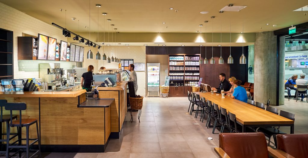
• The Vintage Cafes – These cafes have old-world charm with minimum use of modern-day subtleties. The vibe they try to create is that of a vintage warehouse or a small-scale countryside cafe.
The overall atmosphere is pretty comfortable and intimate, with a lot of warm lights, earthy colours, greenery, and decor that looks antique.
You’ll find exposed brick walls, plenty of indoor or outdoor plants, old bookshelves, and simple pendant lights in these cafes.
<script async src="https://pagead2.googlesyndication.com/pagead/js/adsbygoogle.js?client=ca-pub-1037652534985097"
     crossorigin="anonymous"></script>
<ins class="adsbygoogle"
     style="display:block; text-align:center;"
     data-ad-layout="in-article"
     data-ad-format="fluid"
     data-ad-client="ca-pub-1037652534985097"
     data-ad-slot="5244006718"></ins>
<script>
     (adsbygoogle = window.adsbygoogle || []).push({});
</script>
TIP #4
The Lighting Setup
What makes a good cafe interior design into a brilliant interior design? Yes, the lighting setup! Especially when the cafe interior design in question is that of a cafe or a restaurant, lighting plays a crucial role to create the right kind of atmosphere for your customers.
You can use the lighting setup to set a positive, vibrant, and comforting mood and amplify the appetite of your customers.
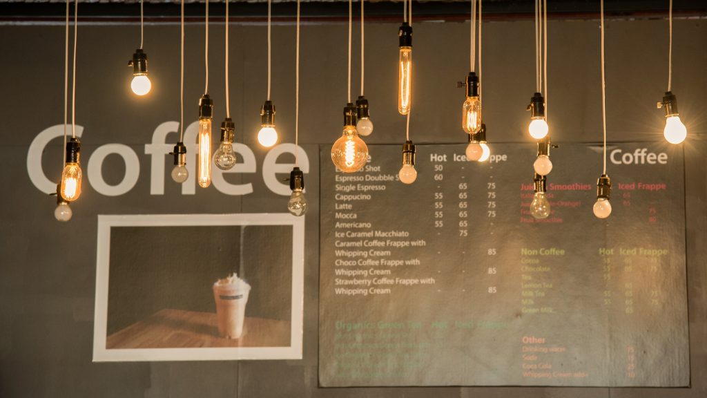
Below, we’ve discussed how to pick the perfect lighting setup for your cafe that harmonises with the vibe of your place effortlessly –
a) Artificial Lighting Ideas – There are three main types of artificial lights that you can use, including accent lights, ambient lights, and decorative lights.
Depending on what type of space you have and what kind of atmosphere you are trying to create, you can mix and match these three types. If you want, you can even get a customised lighting setup specially designed for you that suits your specific requirements.
• Accent Lights – These kinds of lights are used to accentuate specific features of your cafe, such as your food displays, paintings, or artworks.
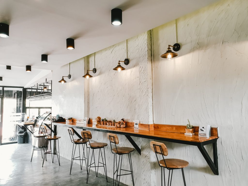
• Ambient Lights – These lights work as the primary source of illumination inside your cafe. Their job is to spread an equal amount of light, illuminating the entire space.
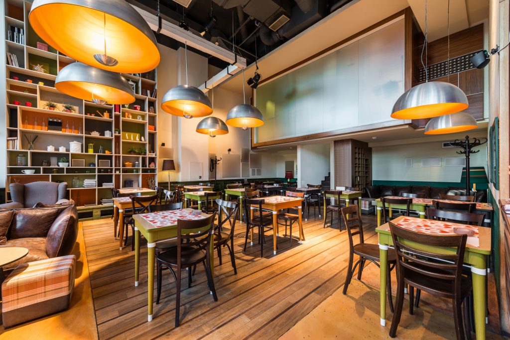
• Decorative Lights – These lights are used to add beauty and finesse to your original cafe interior design. Choose a setup that complements the intrinsic theme of your cafe.
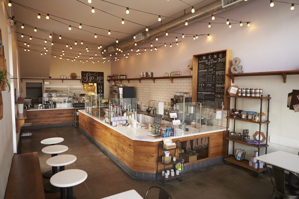
b) Natural Lighting Ideas – Easiest way of creating a refreshing, sustainable, eco-friendly, and spacious cafe interior design is to use as much natural lighting as possible. Outdoor or open spaces with natural lighting are everyone’s favourite!
TIP #5
Play Around with the Layout
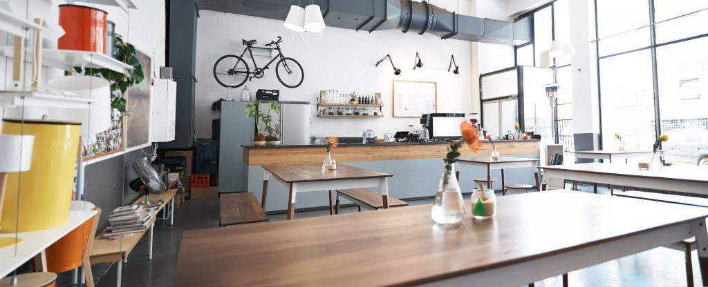
The layout of your cafe forms the core of your cafe’s interior design. There are so many options to pick from. You can go for the simple table-chair layout, or you can install booths. You can even consider floor seating if your theme allows you to!
The critical thing to remember is that you have to create a delicate balance between your layout’s aesthetic appeal and the functionality aspect of it. There should be enough aisle space (space between the tables) but not so much that it starts looking distant and dull.
TIP #6
‘Make em Hungry’ with Your Cafe Interior Design
Have you heard about colour psychology? You can use human psychology to your advantage and stimulate the appetite of your customers using your cafe interior design. Yes, that’s right! This mainly involves playing with certain colours and lights in a certain manner.
• Use of Colours – Experts say that deep, rustic colours, when combined with touches of gold, help stimulate the appetite of your customers in a subtle manner. That’s why most of the big restaurant chains have red or brown interiors with a hint of gold here and there.
<script async src="https://pagead2.googlesyndication.com/pagead/js/adsbygoogle.js?client=ca-pub-1037652534985097"
     crossorigin="anonymous"></script>
<ins class="adsbygoogle"
     style="display:block; text-align:center;"
     data-ad-layout="in-article"
     data-ad-format="fluid"
     data-ad-client="ca-pub-1037652534985097"
     data-ad-slot="5244006718"></ins>
<script>
     (adsbygoogle = window.adsbygoogle || []).push({});
</script>
• Use of Lighting – Keep in mind the importance of lighting as well when you employ colour psychology to plan your cafe’s interior design. Use your lighting setup to highlight the golden features.
• The Ketchup Mustard Analogy – This is another very popular phenomenon people follow to redesign the interiors of their eateries. It basically suggests that shades of red and yellow are most effective when you want to stimulate someone’s appetite.
However, we’d recommend not going this road for a cafe interior design. This trick has worked very well for brands like McDonald’s and KFC, but a cafe’s environment is usually very relaxed and laid back as compared to that of these fast-food restaurant chains.
Though, if you really want to try it, we’d suggest applying the rule in a much subtler manner.
• The Gastronomic Analogy – Architects use this concept while developing a commercial design for a store, restaurant, factory or even an office space. This concept says that if you use physical manifestations of the foods which you are trying to sell, you can attract your target audience more easily.
For example – in an ice cream parlour setting, images of strawberries or chocolates would work very well to attract more customers. For cafe interior design, one could think of simple ideas like fibreglass coffee mug pendant lights.
TIP #7
Do Not Forget the Music
Along with the visuals, you can also use sounds and music to redesign your cafe’s feel and vibe. With the right kind of music, you can easily set that perfect mood that’ll attract loads of customers inside the cafe. Just make sure that the music is going with the colour scheme and the theme of your cafe.
Some cafes play their music too loud, while at some of these places, you struggle to figure out which track’s going on. Both are a big no-no! So, find that perfect volume level that’s neither too loud nor too soft and watch your customers tapping their feet as they enjoy your delicious food inside your stunning cafe fitout!
Resources
You may also be interested in:
- 20 Restaurant Interior Design Themes To Inspire Your Creative Genius
- An Impeccable Cafe Design Guide
- Restaurant Startup Cost Guide
- Restaurant Interior Design Tips – An Impeccable Guide In 2020
- 7 Coffee Shop Lighting Tips & Tricks For The Perfect Ambience
- 15 Cafe Theme Ideas To Captivate Everyone’s Attention

