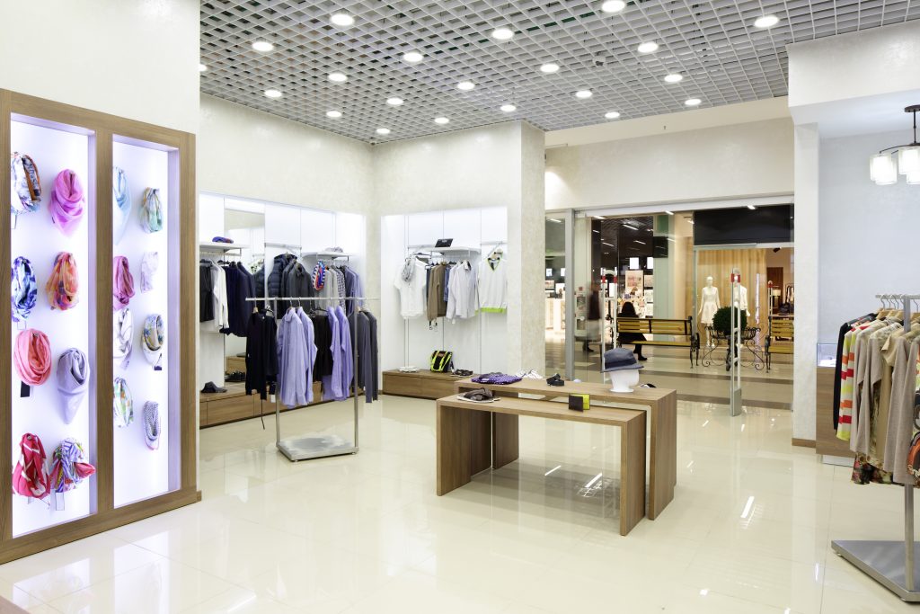
It’s not a big secret that some of the most successful retail businesses of today’s time started their journeys from small spaces. The key is to survive those difficult first few years by employing every trick in the book that’ll help you thrive.
One such super effective trick is to use your interior design to your advantage. You can use your interiors not just to create an aesthetically pleasing space for your store, but to tell your story and to show your customers what your brand or products are all about.
Plus, when you sit down to design a pragmatic small retail store layout that’ll work perfectly for your space, you get to play with your imagination and show the world how creative and resourceful you really are.
Our mantra is to go with simple ideas that can generate maximum results for your small retail store layout.
These ideas will help you design your space and organize your merchandise in a simple but highly strategic manner.
So, here’s our list of top 8 design ideas for planning a small retail store layout with limited space and budget.
Small Retail Store Layout Hack #1
Catchy Exterior
Before we move inside the store and start talking about what can be done there, let’s first talk about the exterior of your retail store. A small retail store layout automatically means smaller windows.
So, you need to be extra creative while approaching your exterior design because with your limited resources you’re competing for the attention of your potential customers.
You might think the obvious thing to do is to fill your window display with all your marketing materials, right? However this is not a great idea since it makes your interior look cramped up and also, this could block the natural light from entering your store.
The best approach is to keep your windows as bare as possible so that people could see what you’re selling and how you’ve designed your interiors. If your interiors are attractive enough, all it takes is just one look inside to entice your potential customers to step inside and check your store out.
Make sure your exterior is welcoming and interesting. You can even place a sandwich board outside with a classic quote on it that indirectly (or directly) says something about your store or merchandise. If you have some outdoor space, you can even display some of your products outside.
This would definitely tempt people to enter your store to check out more of your stuff or to buy what you have on display outside. Interesting and modern signage could also make a world of difference.
Pick a sign that matches your core theme, is easy to comprehend, and says something about your story.
Small Retail Store Layout Hack #2
Keep the Space Spick and Span
One of the biggest mistakes most people make while working with a small retail store layout is – they end up turning their store into one big pile of clutter. This happens because they think there isn’t enough space, but that’s not an excuse to stock up everything one over the other and create a mess of everything.
A cluttered, untidy space makes your store look and feel even smaller than it actually is. So, here’s how you can declutter your space to create a neat and tidy looking small-sized retail store –
• Make sure your shelves aren’t too busy. Pick the best of your products and display them in a nice and attractive manner.
• No matter what, do not stack things up on the floor, creating a pile of products against the walls. This confuses your customers or could make them feel claustrophobic.
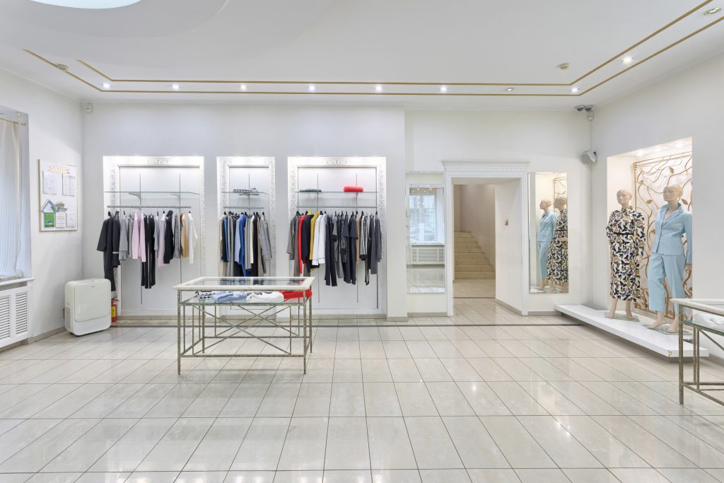
• Play around with neutral colours such as grey and white for a spick and span look, especially around your shelves and display windows.
• The kind of furniture and shelves are important considerations when it comes to having a store which is organized and tidy. It’s ideal to use versatile furniture like – plush chairs, long clothing racks, and small coffee tables. Pick options that do not take up a lot of your space and their shapes and sizes are such that the room starts looking bigger and breezier than it actually is.
• Where you put your furniture also makes a huge difference. Make sure your furniture isn’t cramped up in one corner of the store. There should be enough breathing space and there should be a sense of harmony in the store because of how you’ve placed your furniture.
The idea is to make your customers feel comfortable inside the store. When your interior is neat and tidy, your customers wouldn’t mind spending hours inside the store browsing through stuff. Making it easier to attract new customers and thereby increasing your sales.
Small Retail Store Layout Hack #3
Make Your Store Look Spacious
You can make your retail store look more spacious and airy by playing around with just about everything that comes under the umbrella of interior designing.
Be it the colour of your walls, the furniture, lighting, flooring, ceiling, windows, or the decor, everything can be picked or modified to create the illusion of space while planning a small retail store layout.
Here are our 3 quick tips on how you can do that –
1) Go With the Minimalist Approach
A minimalistic design approach encourages you to make a list of everything that’s absolutely essential in your store. This includes your furniture, accessories, decor, even the merchandise on display. Once you’ve identified what are those objects, you go ahead and discard everything else that’s unnecessary and cluttering.
This approach makes your space look really sophisticated, well-organized and roomy. The best part about this trick is that your store’s layout would become so simple and effective and that too at no additional cost of any kind.
2) Install Mirrors
Placing floor-length mirrors is another great trick to make your store appear more spacious. You can place mirrors between your displays or you can put them against the entire length of a wall. Make sure you use this mirror wall as a style statement and not for utilitarian purposes because that would make your store look disorganized and bizarre.
3) Large Windows to Let the Natural Light In
This is one of the most effective ways of making your store look more spacious, and your merchandise appearing fresh and attractive. By adding wall-sized glass window panels to your small retail store layout you could create a welcoming vibe and also, this will help you save tons of money on your electricity bill.
Alternatively, you can add a skylight to let plenty of natural light during the daytime. There are two main types of skylights – fixed units and venting units. Pick the one that goes with your store’s layout. Also, make sure your skylight unit is absolutely waterproof and there are no leaks anywhere.
Small Retail Store Layout Hack #4
Multiple Levels of Shelves
When you are working with a small retail store layout, one of the biggest issues that you have to face is to find sufficient shelving space to display your products in a well-organized and attractive manner. To resolve this matter, you need to think vertically!
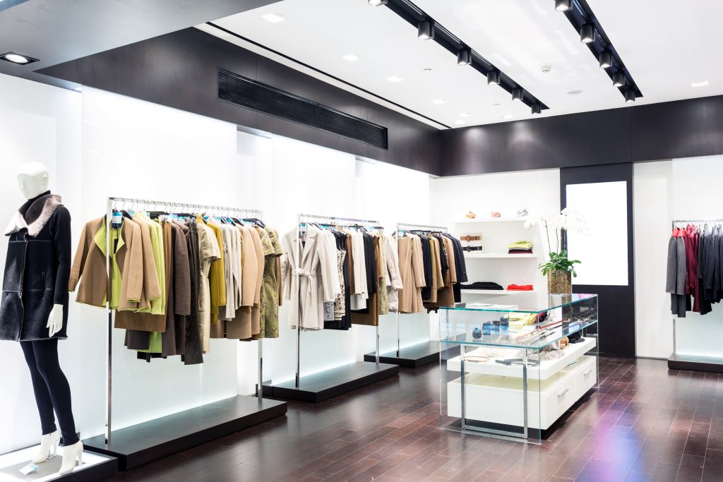
Display your merchandise on multiple levels using the height of your walls to maximize the space. Multi-level displays are visually more appealing than regular shelves and installing such displays is the easiest way to create more space for all your shelving needs.
You can use hanging shelves for this purpose or you can mount ropes or metallic stands from the ceiling to the floor. It’s advisable to hire a professional retail fitout company who could help you build and install your joinery cabinets and shelves.
When it comes to customizable, multiple-level shelves, you don’t have to settle for the boring displays you see everywhere. In fact, this is your chance to be creative! Think out of the box and create an impressive style statement with your shelves.
Unique displays are a sure-shot way of grabbing your customers’ attention, increasing shareability, and giving your customers positive brand experience.
Small Retail Store Layout Hack #5
Using Lighting to Your Advantage
While we’ve talked about using as much natural light as possible during the daytime, artificial lights are also a very important aspect of any small retail store layout. Your customers tend to feel claustrophobic and anxious if your store is dark and dingy.
So, pay a lot of attention to how you are going to light up your space. By using the right kind of lighting setup, you can actually make your retail store look bigger and airier.
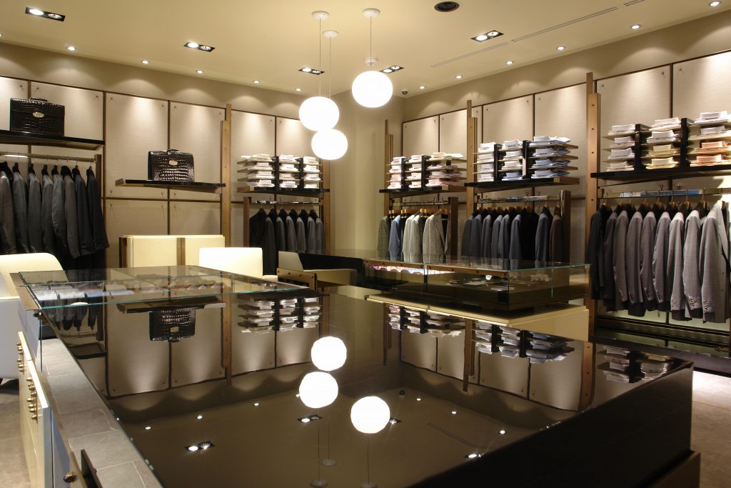
You can use recessed lights as your main source of illumination. Combine them with scones and accent lights to complete the look. Sconces will light up the darker corners of the room while accent lights will highlight the important areas of your store such as – your central displays, wall shelves, and window displays.
Make sure your lights create a simple, soft, easy on the eyes lighting setup, instead of creating a fancy but confusing layout that could give a headache to your customers.
How you light your interiors is important but don’t neglect your exteriors either. Your exteriors should be well-lit as well. Experiment with different kinds of lights and see what works best for your store. You can play around with lamps of various kinds, shapes and sizes, track lights, and picture lights.
Small Retail Store Layout Hack #6
Pick a Light Coloured Palette
As a rule, lighter colours make your space look spacious and comfortable while darker shades, especially if they aren’t balanced properly, make your space look cramped up and gloomy. This doesn’t mean you can’t use dark shades at all.
You can use them but the primary colour of your theme, the one which covers the maximum area of your store should be a lighter one. For example, you can use royal blue to highlight your displays but with white as your primary background.
Here are our 4 pro tips when it comes to picking the right colour palette for a small retail store layout –
1) If you want to create a bold look, instead of bold colours, use bright tones of lighter shades only.
2) Use accent colours and bolder shades only till your eye level and lighter colours and neutral shades above the eye level to create a sense of harmony and balance.
3) Another great tip is to paint the ceiling and trim of your store a shade even lighter than your primary colour to add height to your space. This will help you remove visual breaks as well.
4) You can also use patterned or printed fabric wallpapers to make your space feel bigger and brighter, but make sure the design on the wallpapers matches the core theme of your store.
If you are going for the wallpaper look, it’s recommended to go for easily removable wallpapers so that it becomes easier to switch the look of your store whenever you want.
Small Retail Store Layout Hack #7
An Accent Wall to Keep Things Stylish
Working with a small retail store layout doesn’t mean you have to compromise on the style factor!
By creating an accent wall you can amp up the style quotient of your store and make your space look really interesting and glamorous. Earlier we’ve told you to use only lighter shades to make your space seem larger but there are certain circumstances where you can use dark coloured walls.
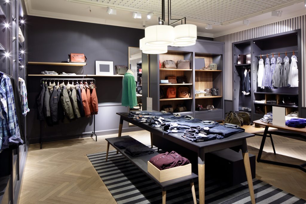
An accent wall actually helps your store look more spacious. One dark coloured wall surrounded by light coloured walls all around would create an illusion that it’s receding. This will give the impression of a more spacious room.
Observe for a few days which wall of your store naturally grabs your customers’ attention as soon as they enter the store. That’s the wall you need to paint in a vibrant, fun colour. You can also experiment with various kinds of textures and patterns.
Whatever you choose, should go with the theme of your brand. One way you can ensure that your accent wall is going well with your core theme is to place small accessories and decorative items in a few corners of your store in the same colour which is the colour of your accent wall.
If you think painting a wall is not an option, you can consider other alternatives like printed curtains, wallpapers or fabric sheets. Using fabric to cover a wall is actually a great idea as it can make your space feel relaxed and cosy if done right.
Small Retail Store Layout Hack #8
Add Your Personal Touches
Do your research, understand the needs of your customers, gather all the information about the current market trends, but at the end of the day, you need to add your own personality to your brand and to your retail store if you really want to stand out.
This is especially important when you are designing a small retail store layout since the goal is to be extra creative in order to compensate for the shortage of space.
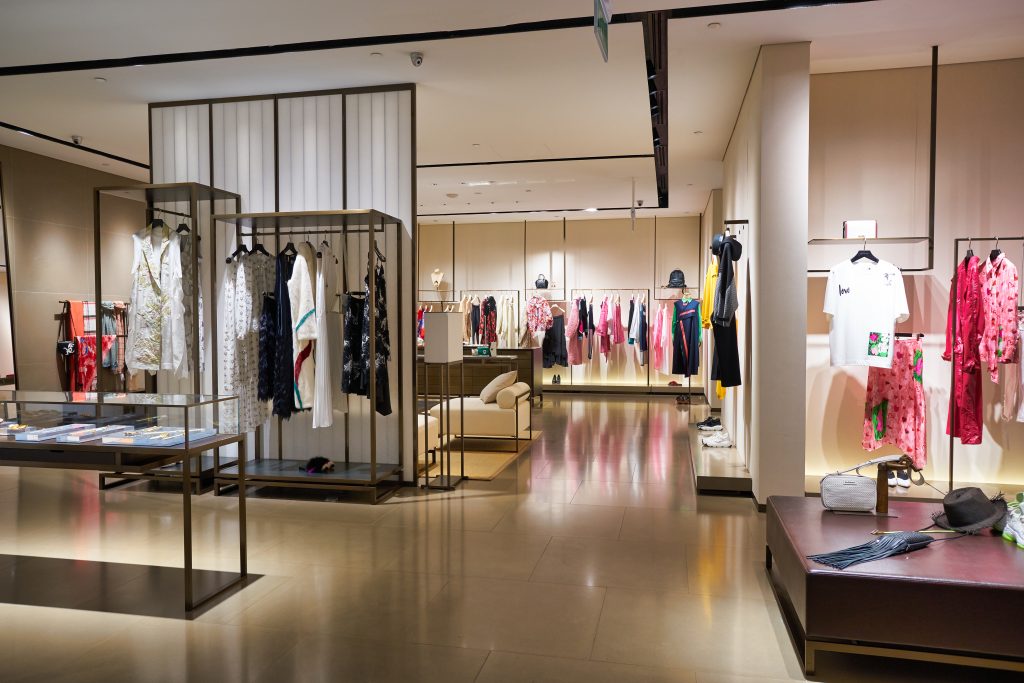 Your small retail store layout should feel like it’s been specially created for your brand. It should have charisma and personality of its own. Your aim should be to give your customers a unique, fresh and exciting brand experience.
Something they’ve never seen before! They shouldn’t feel like your store is just like every other store on the street with that same boring design and aesthetic sense.
Use your DIY talents to add your personal touches or design your own decor, pieces of furniture, or accessories. You can also build your own modifiable storage units to store all your extra items in a fun and creative manner. Just go with your natural instincts and keep adding and subtracting stuff as per your understanding and awareness.
Conclusion
When it comes to designing a small retail store layout you have to play with your imagination and creativity. Look for ways to make your store appear and feel more spacious and comfortable. In order to grab the passerby’ attention, you need to create an atmosphere of intrigue but in a relaxed and orderly manner.
No matter what tactic you are employing to make your space look roomy and attractive, always stick to your core theme.
Also, borrow ideas and inspirations but never copy the exact same style someone else has used in their store.
Follow our guidelines and throw in some of your own ideas and voila, you’ll have a stunning, small retail store layout at your disposal in no time at all!
Resources
If you enjoyed reading our small retail store layout hacks, you may also be interested in:

