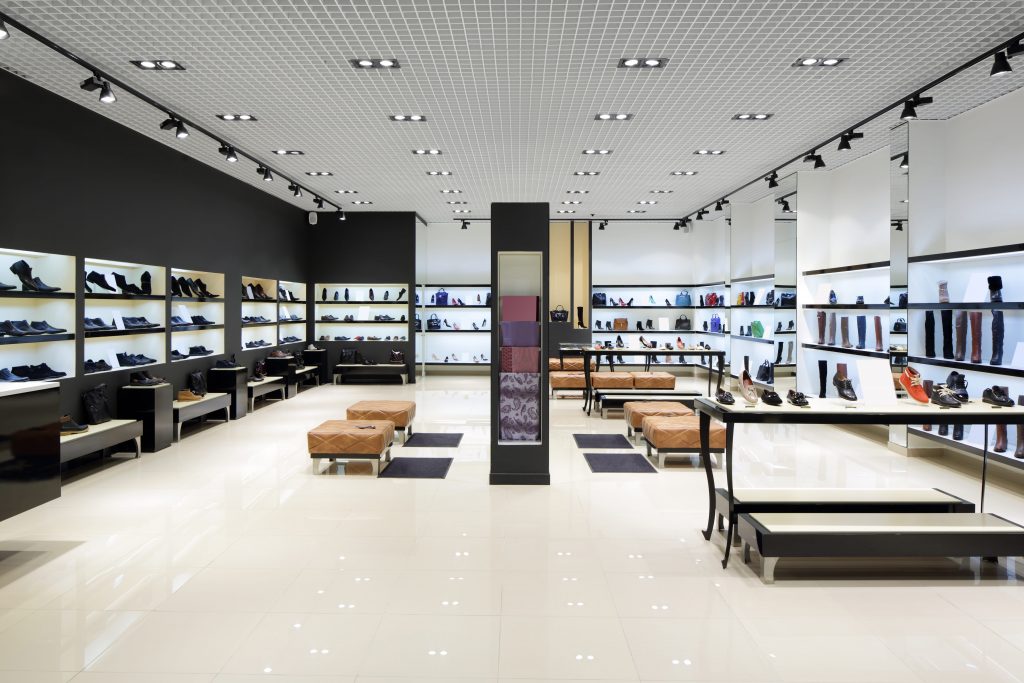
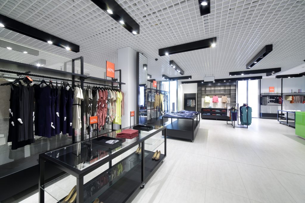
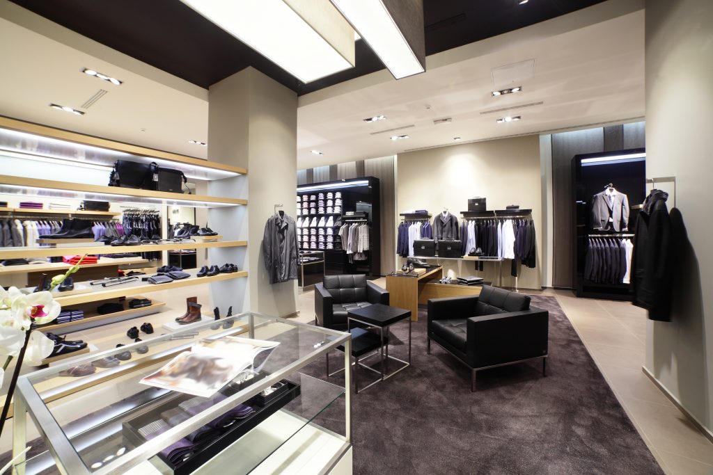
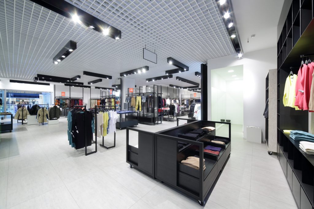
It is of great importance that your products take centre stage in your retail space. Various interior design approaches can be adapted by retailers, to maximise their retail store interiors to full potential – thereby increasing business sales significantly.
Retail has been in existence for quite a while, and we will work you through the best practices to achieve great results.
Currently, we live in a digital era. Boundaries continually get pushed and changed. Retail merchants – to thrive, have to put just the right amount of effort into the design of their retail store interiors.
To be successful, the measures to be in place range from branding to captivating window displays, signage essentials and many more. Retail store interiors must create a profoundly engaging shopping experience for every potential client that walks through the doors.
Unsure of where or how to begin with the layout and design of your retail store interiors?
Lucky for you, we will cover the basics of retail store interiors, and how to optimise your space to suit the customer’s needs – in terms of functionality and appeal. We will also be touching on methods to attract new customers, get them to browse your products, and eventually make a purchase.
Very often, the science behind the art of retail store interiors and design is overlooked. Note that as soon as a prospective client steps into your space until a purchase is made, design decisions made in that space played a vital role. Same goes when they leave the store without buying a thing.
7 Factors To Consider When Designing Retail Store Interiors:
TIP #1
1. The Threshold
The threshold is the initial space or section of your retail shop from which customers enter, i.e. the very first 1.5 to 4.5 metres worth of space.
The threshold is where prospective buyers make a crucial judgement about the class of your brand and retail store interiors, i.e. how affordable or luxurious your products are.
Their decisions are highly influenced by the coordination of your lighting, displays, fixtures and colours. Please take note that it is quite common for shoppers to miss products and signage placed in this space, as they are in transition mode.
TIP #2
2. Turn Right!
The first wall a shopper sees upon entry is referred to as the ‘power wall’. Studies show that 90% of shoppers unconsciously turn to the right when they enter into a store. The power wall should, therefore, be given extra attention – in terms of its design and display.
You want to create a significant impact right from the start!
Products on display should be captivating enough to grab their interest, so, we would suggest new, high-demand or seasonal products/items.
TIP #3
3. Create a Path for Shoppers
It is essential to consider how you would like shoppers to move through your retail space. Various approaches are depending on the experience you would like to create. Furniture, display, racks and so on can be used to create a clear path in the store.
Ensure that the path created allows buyers to continuously walk through the store and gain the highest exposure to all your merchandise. This strategy improves the likelihood of them purchasing at least one item.
This path design is also an excellent way to control the flow of traffic and reduce the clutter of buyers in one spot.
Numerous retail store interiors adopt a circular flow, as it allows shoppers to walk to the rear of the shop and out through the front.
Designers suggest differing the flooring of the path and rest of the space, as this will catch the eye of the customer. It is referred to as visual merchandising.
A trick for this style is that the path should lead somewhere. Try placing an attractive display at the rear of the aisle; something with a pop of colour, maybe.
Based on the type of products sold, the location of changing rooms, sales counter, and the amount of room to move around, come together to form the traffic pattern of your shoppers.
TIP #4
4. Slow Down Movement
After putting in so much hard work and time, you want shoppers to notice and appreciate every little detail. Modern customers are very busy and tend to shop hurriedly.
If they rush past the store, they end up purchasing fewer items. This issue can be avoided by designing splits or divisions that cause people to pause – something similar to ‘speed bumps’ on the roads.
You can achieve this by using any object that gives shoppers visual breaks, e.g. advertisements, signage or displays.
Retailers take advantage of the customer’s likelihood to purchase items on impulse, by displaying exclusive merchandise towards the end of aisles or in-between them.
These displays boost impulse purchases while complementing the items on display nearby. Ensure that the displays are changed or updated regularly, to create a sense of freshness for regular customers.
Group products in a way, so it is convenient for your customers, but try not to overwhelm them with too much of it. All products must be easily visible even if you do not have typical retail aisles. Place higher-end products on eye level, and lower-end ones above eyesight level or at the bottom.
Related: Wall Street Journal – The Slower You Shop, The More You Spend
TIP #5
5. Prioritise Comfort of Shoppers
In recent times, an increasing number of shoppers turned to e-commerce for purchase of products. Brands have since had to make their spaces as captivating, interactive and comfortable as possible.
This is the case even in situations where the customer is really interested in the item(s). Ensure that the aisles and floors are widely spaced and allow for adequate movement and personal space. Depending on the arrangement of the aisles, customers should not brush against or bump into each other.
Another trick is to add a waiting area, which has comfortable seating and benching, to your space. This controls traffic flow and often results in shoppers spending more time at the store.
It can also come in handy in the case of shoppers with guests who are not interested in purchasing an item, as they can wait there. Ensure seats face the store and merchandise, so they remain present in the minds as they wait.
TIP #6
6. The Checkout Counter
The correct positioning and location of the checkout and POS of a break-and-mortar retail store is essential. An unwritten rule is that the checkout counter should be positioned at a natural ending point of your layout design.
If adapting the circular flow, for example, and customers have to turn right upon arrival, you realise the front left-hand side is probably the best place to locate your counter.
However, the size and shape of the store are determining factors as well. In this case, you will have to decide using your best judgement.
The layout of a store that is run by one person will slightly differ from one that has staff supervising the shop. For the former, it is essential to be able to see everything happening within the premises, to prevent loss of merchandise.
These are other suggestions to put in mind while thinking about the design of your checkout counter:
- It should be wide enough for customers to place purses, wallets and personal items.
- If the counter is located in front of an empty wall, use this as an opportunity to create attention-grabbing displays.
- Take a tip from big groceries stores, and stock items consumers need or regularly need near to the checkout point. This trick encourages impulse buying.
TIP #7
7. Moving Forward!
The design of retail store interiors is a continuous process. Little tweaks and upgrades will be made along the way, as a means of catching up with trends and improving customer experience. Ultimately, the customer is your top priority.
Upon completion, it would help if you took a walk around the store yourself to notice where the visual cues lead you. Family, friends and staff can do the same, and maybe even provide honest feedback and suggestions.
Observe your shoppers. Please take note of what they are attracted to, and those they avoid. Study how they move around the space, as this will come in handy when upgrades are to be made.
Do not forget that interior design plays a very significant role in the appeal of any retail store interiors or brands. So, stay in the loop with the latest styles, trends and customer needs. You will be glad you did!
Resources
If you found the above article helpful you may also be interested in:


